![]()
Interactive plots with plotly and ggplotly
Week 12
Goals of this Lecture
- Get familiar with plotly
- Discuss options for interactive plots
What is plotly?
Plotly website: “plotly is an R package for creating interactive web-based graphs via the open source JavaScript graphing library plotly.js.”
We are going to explore plotly as a ggplot2 extension that will allow as to create interactive plots from ggplot2 objects.
Logo retrieved from Plotly website:
Why use plotly?
Plotly is one the most popular platforms to create interactive plots. It is well maintained, clearly documented, very beautiful, and easily integrated into ggplot2.
Installing plotly
# From CRAN
install.packages("plotly")
ggplotly()
Image retrieved from this blog.
Description
This function converts a ggplot2::ggplot() object to a plotly object.
ggplotly(
  p = ggplot2::last_plot(),
  width = NULL,
  height = NULL,
  tooltip = "all",
  dynamicTicks = FALSE,
  layerData = 1,
  originalData = TRUE,
  source = "A",
  ...
)
Now, we are going to explore using plotly on ggplot objects using ggplotly().
Scatter plots
# Tip: Always load libraries at the beginning of the markdown documents

library(tidyverse)
library(plotly)
library(ggsci) # for color palettes
library(htmlwidgets) # for saving interactive plots
Basic scatter plot
ggpenguins <- palmerpenguins::penguins |>
# note that x is the default first argument and y is the second
# and this works even though we haven't said this explicitly
  ggplot(aes(bill_length_mm, body_mass_g, color = species )) +
  geom_point() +
  scale_color_d3() + # from ggsci
  theme_bw() +
  labs(x = "Bill length, in mm",
       y = "Body mass, in g",
       color = "Species",
       title = "Palmer penguin body mass by bill length")

ggpenguins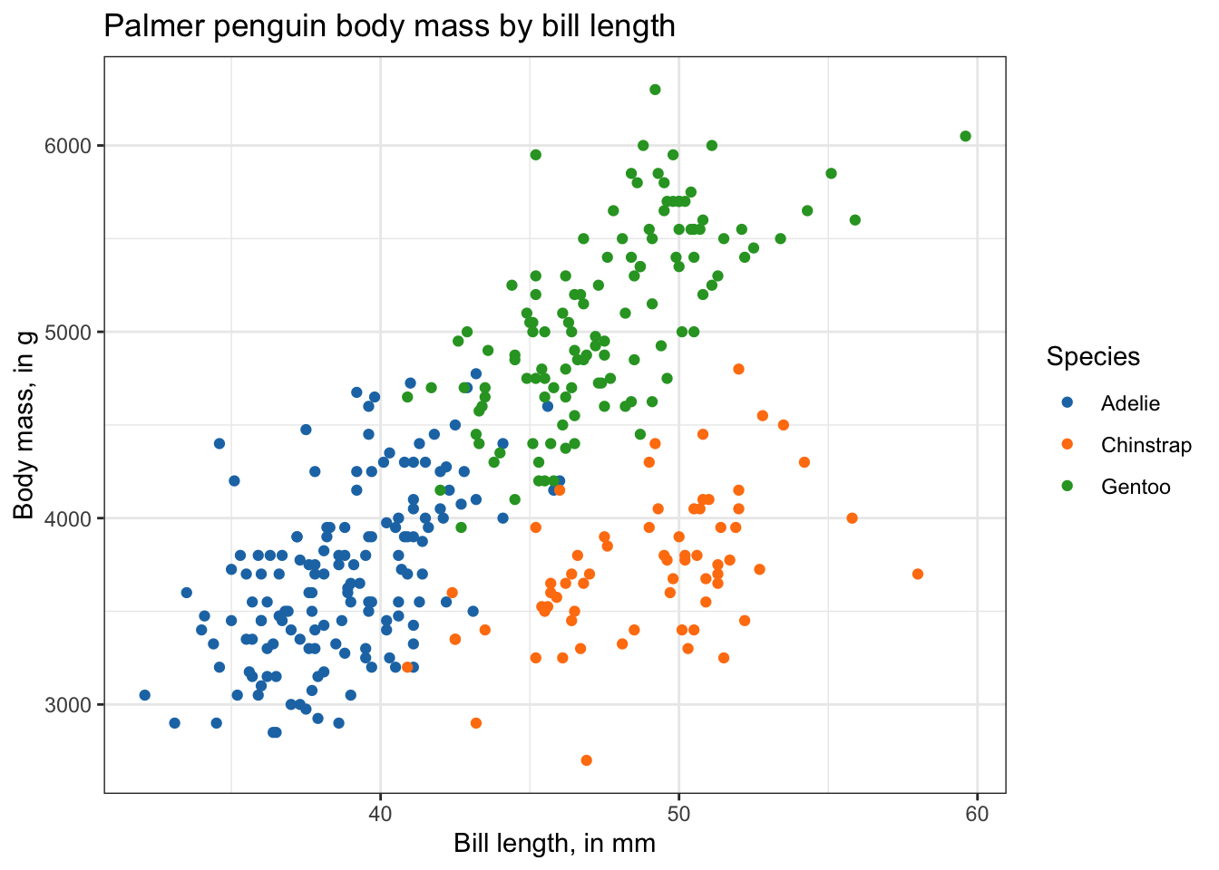
Things you can do with an interactive plot:
- Zoom in and out
- Turn off groups (click on the legend)
- Download plot as a
.png(click the camera)
ggplotly(ggpenguins)PCA
# Library here just to make emphasis
library(ggfortify)
In this case we are going to explore a new library ggfortify that accepts prcomp results and creates an automatic scores PCA plot.
After you perform PCA analysis, you can use autoplot() to create a ggplot2 object for using in the ggplotly() function.
df <- iris[1:4] # Extract numeric variables

pca_res <- prcomp(df, scale = TRUE) # Run PCA

p <- autoplot(pca_res, data = iris, colour = 'Species') + # PCA autoplot
  scale_color_d3() +
  labs(title = "Scores plot of iris data")

ggplotly(p)
Distribution plots
Boxplots
Data used here is midwest from ggplot2 which contains demographic information from census data collected in the 2000 US census. The variable percollege includes what percentage of the respondents are college educated.
boxplot <- ggplot(midwest, aes(x = state, y = percollege, color = state) ) +
  geom_boxplot() +
  scale_color_d3() +
  theme_bw() +
  coord_flip() +
  labs(title = "Percentage of college educated respondents")

ggplotly(boxplot)
Barplots
stack_barplot <- ggplot(mpg, aes(x = class))   +
  geom_bar(aes(fill = drv)) +
  scale_fill_d3() +
  theme_bw() +
  labs(title = "Class of cars in the mpg datase")

ggplotly(stack_barplot)
Hover label aesthetics
Tooltip
Tooltip is an argument that controls the text that is shown when you hover the mouse over data. By default, all aes mapping variables are shown. You can modify the order and the variables that are shown in the tooltip.
In the penguins data we have more variables that may want to include in the text shown in our plotly plot such as sex and island.
# dt[seq(10),] subset the ten first row and then use glimpse to shorten the output
glimpse(palmerpenguins::penguins[seq(10), ])
Rows: 10
Columns: 8
$ species <fct> Adelie, Adelie, Adelie, Adelie, Adelie, Adelie, Adel…
$ island <fct> Torgersen, Torgersen, Torgersen, Torgersen, Torgerse…
$ bill_length_mm <dbl> 39.1, 39.5, 40.3, NA, 36.7, 39.3, 38.9, 39.2, 34.1, …
$ bill_depth_mm <dbl> 18.7, 17.4, 18.0, NA, 19.3, 20.6, 17.8, 19.6, 18.1, …
$ flipper_length_mm <int> 181, 186, 195, NA, 193, 190, 181, 195, 193, 190
$ body_mass_g <int> 3750, 3800, 3250, NA, 3450, 3650, 3625, 4675, 3475, …
$ sex <fct> male, female, female, NA, female, male, female, male…
$ year <int> 2007, 2007, 2007, 2007, 2007, 2007, 2007, 2007, 2007…ggplotly(ggpenguins)“colour” is required and “color” is not supported in ggplotly()
ggplotly(ggpenguins,
         tooltip = "colour")
Changing hover details
You might not like the default hover text aesthetics, and can change them! You can do this using style and layout and adding these functions using the pipe (|> or |>).
Code taken from OSU’s Code Club
# setting fonts for the plot
font <- list(
  family = "Arial",
  size = 15,
  color = "white")

# setting hover label specs
label <- list(
  bgcolor = "#3d1b40",
  bordercolor = "transparent",
  font = font) # we can do this bc we already set font

# amending our ggplotly call to include new fonts and hover label specs
ggplotly(ggpenguins, tooltip = "colour") |>
  style(hoverlabel = label) |>
  layout(font = font)
Saving ggplotly() objects
After you have done an amazing job creating a beautiful ggplot and made it interactive, you might want to save in a file. Here, you have two options, create a markdown and knit your interactive plot in a .html file, if you knit in a static file such as pdf or word file, you will lose the interactive part of your plot.
You will need to assign the interactive plot to an object, and then, export or save your plot to an .html file.
You can export your interactive plots by using the saveWidget() function from the package htmlwidgets. If you do not have this package, you can install it by:
install.packages("htmlwidgets")Now we can create an ggplotly object to save, and then save it as a standalone .html. Remember this will save only your plot, not your whole RMarkdown.
# assign ggplotly plot to an object
ggplotly_to_save <- ggplotly(ggpenguins, tooltip = "colour") |>
  style(hoverlabel = label) |>
  layout(font = font)

# save
saveWidget(widget = ggplotly_to_save,
           file = "ggplotlying.html")